The Rise of Retrobranding
Nostalgia in a digital age; a longing for local, community values in a culture of globalisation; striving for trust in a world that mistrusts big business; fear; bravery; trend. Whatever the reasons (and there are many), more and more rebrands are looking back to move forward.
Coop
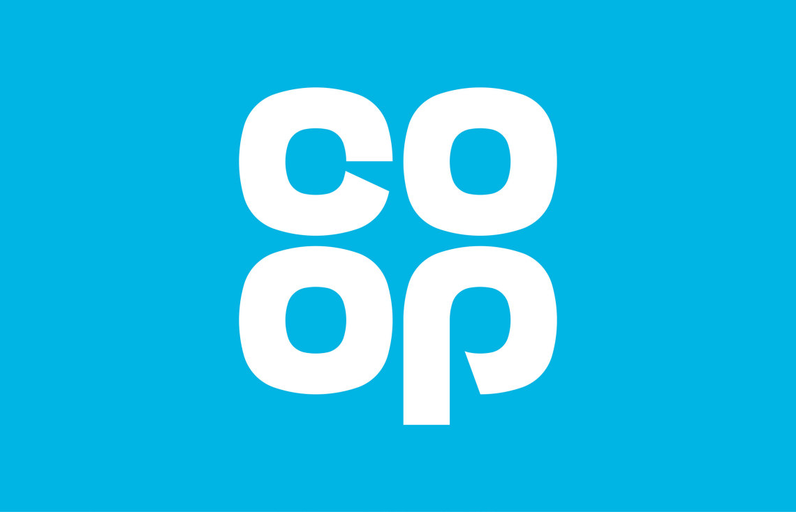
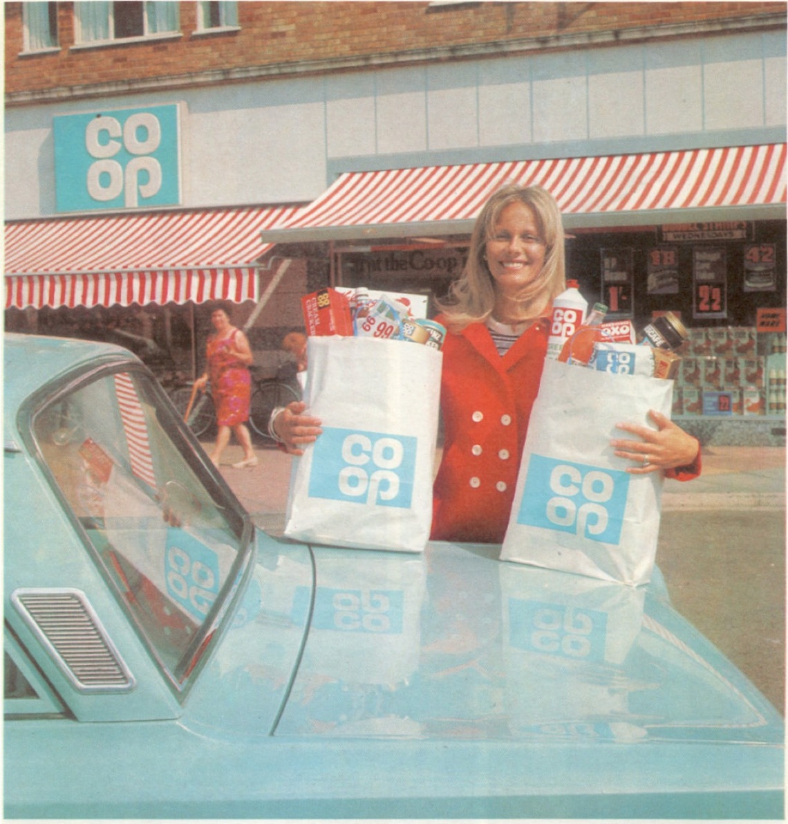
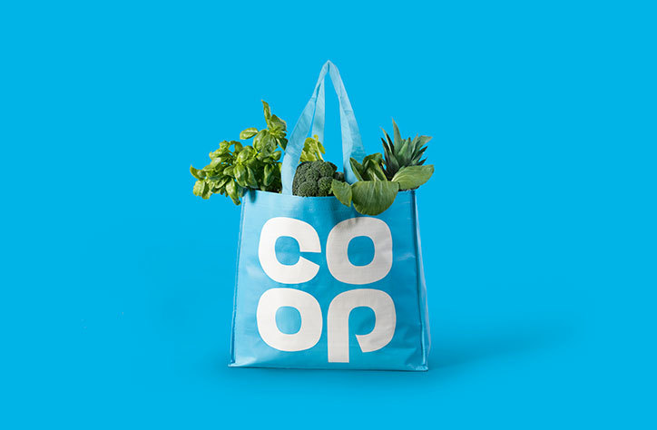
Supermarkets get a bad rap. But as the best of a seemingly-bad bunch – recently voted the UK’s most ethical supermarket – the Coop has a lot of heritage and trust it can capitalise on. So this rebrand makes perfect sense. It captures nostalgia, screams ‘you can trust us' and makes a virtue of the chain’s relatively small stores, which feel more like local shops than supermarkets.
Banks. What’s left to say? They’re consistently rated one of the least trusted industries – up there with politicians in Ipsos MORI’s January survey and 32% behind hairdressers(!) So it’s really no surprise that many are sticking with logos from a time when banks were a trusted, respected presence on every high street.
Two of the biggest? Lloyds and NatWest.
NatWest
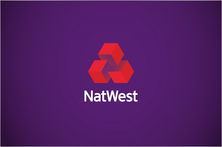
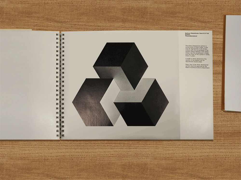

This got torn to quivering, blubbering pieces by Michael Wolff in Design Week, described as the bank’s 'attempt at enlivening their existing symbol’. Originally meant to symbolise the merging of three businesses, the logo has long lost that meaning.
So, in going back to the 1968 original, what does it symbolise now? That 'we are what
we do'? That they still believe in the same things today they always have?
They they’re brave? That they’re cautious? Anything at all?
Lloyds
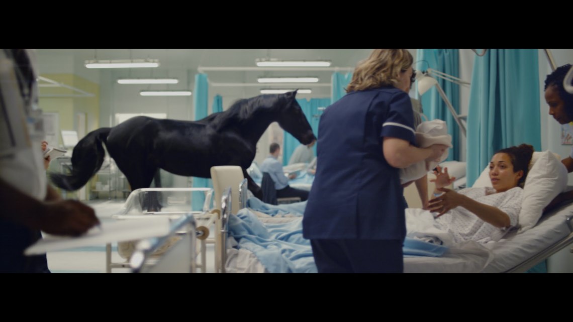
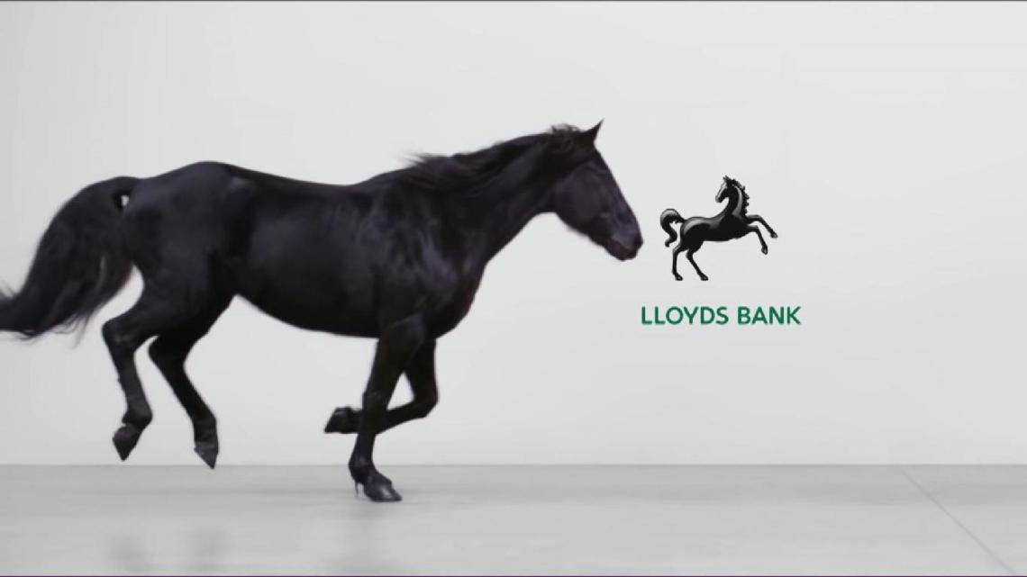
This is more an evolution than retrobranding – Lloyds has never not had the horse.
But it’s in here for the way they use that symbol. The best brands use logo to tell a meaningful story. Here, the tables have turned and, through advertising, the logo has become the story. Which, in such a crowded, undifferentiated market, is a really interesting strategic approach.
Great Western Railway
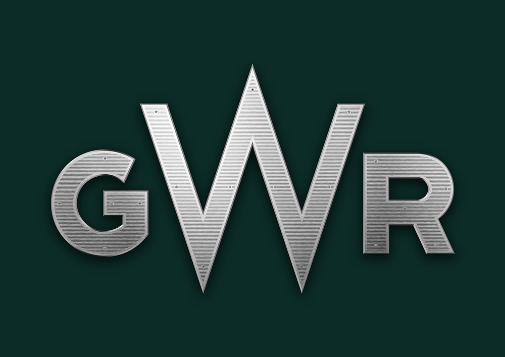
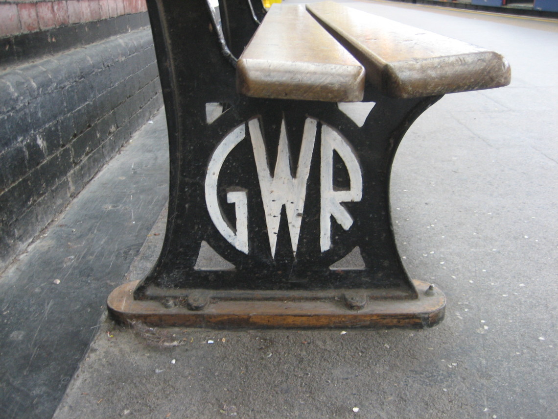
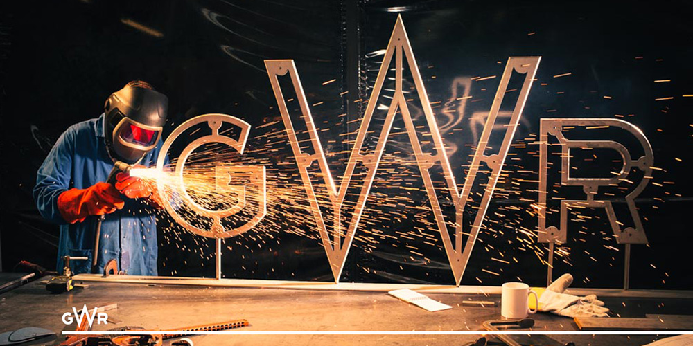
British train services today leave a lot to be desired. As anyone who’s stood on a packed Friday evening chugger from Paddington to Swansea will know, First Great Western are up there with the worst of them. So this is a smart move – take the logo back to a time of steam, power and trains that literally ran like clockwork; take the brand back to a time of Brunel, substance, trust.
DC comics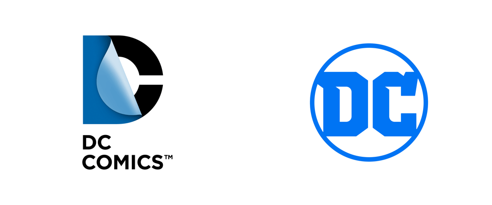
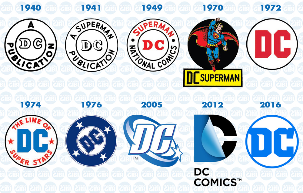
Earlier this year, Pentagram took DC back to their roots, replacing Landor’s turning page logo with a classic encircled ‘DC’. But at the same time as this looks back, it firmly moves DC forward. The new logo is simpler, brighter, bolder. And that makes it more fit for digital – another thing we’re seeing in a lot of rebrands this year…
